
UX Design Case Study
Solution to prepare football fans for their next match on Disney+Hotstar
Design aimed at redesigning the match fixture feature to increase user engagement, and reducing bounce rate by evaluating and improving it , targeting potential daily consumers of football content.

It all started
with....
My dad scratching his head over catching up with Premier League matches he missed, which his favorite streaming app Disney+Hotstar was streaming.
All he wanted to know was...
When Is the next match?
How do I know about the standings?
I am no more a Barca fan, why is it showing me only Barca contents?
How many generic replays do I have to watch exactly to involve myself for the next game?

What happened after this?
You guessed it right, he left! Overwhelmed and frustrated. This is what we call a bounce off right in our technical terms.

Are there more people like him? What do these fans want exactly when they say involve? Is solving the problem in Disney+Hotstar even worth it?
I started by...
Exploring the existing features and flow of the app
This is when I discovered match fixture feature and decided to work with it.
Talking with people who are football fans too
To validate my hypothesis on existing disturbances in flow and understand their needs wrt involvement
This is how the exploration began
Competitor Insights
Youtube and facebook-Indirect
Involvement and knowledge sharing in groups, comments and personal video uploads- helping as a community.
Mu TV - Direct
Best experience to get involved and be prepared before a match. But a majority follow more than 1 club in a tournamnet. So people are not ready to download it.
ESPN - Direct
Used mostly outside India. People use the app regularly to keep them upto date with replays, standings and all information. High footfall because of involving features.
About the users
After conducting qualitative research on 5 football fans this is what I came to know
Competition is everything
The comparison between the teams, players, score is the thing that keeps fans motivated
Insider Information
Fans should feel included in the team they are supporting. News, line ups, strategy expectations is very important for fans to be involved
Match fixture is just the tip to involve
Not able to satisfy users because the match fixture just is a dead end. People want the competition and not just blank information.
Let's Look At The Final Result First
Use Case 1
You are a football fan but just heard about the ongoing Premier League and hop in Disney+Hotstar, how will this app help you?
1.Immediate validation that the app can give you past contents of Premier league
2. When would be the next live match
3. At what point you are entering the tournament
4. Catchup contents like match standings
5. Performances and contents of your preferred team
6. Quick personalisation to get tailored onward experience
Use Case 2
You Are a diehard Liverpool Fan and a football geek, you regularly watch live matches of your team on the app. How can I engage you?
1. Efficient or shortcut to contents and schedule
2. Match highlights of your favorite Team
3. What is the standing of your team in tournament
4. Who is your team competing against
5. Notification reminder for the live match
6. What are the past statistics with the rival team
7. Competitor highlights to understand their form and strength
8. News updates on your team
Use Case 3
You are a football fan and so why you follow more than 1 club in Premier League. How can the app fulfil your needs to catch up ?
1. You do not want to recall and catchup on individual team highlights and replays
2. You will want individual club ranking and points
3. You will look for news on injury and replacements without wanting to jump between apps and different searches
4. As you follow more than 1 team, you will need upcoming match details of each team in assorted manner
Let's look into the User Journey to match fixture page before and after redesigning the flow
Before
After
Key Insights From User Testing
1. Users found it easy to scan every section of football contents available in easier way
2. Task completion rate had 100% success , without any guidance
3. New users/ Users who do not follow football could easily understand what is on the screen and complete task assigned
4. Users liked the way how each click filtered to desired result
5. Navigation felt much easier for the users
6. Time taken to reach the match fixture page decreased significantly
7. Few users used the search bar to get to desired result.
Let's take a deep look into each screen details, and critical decisions taken.
Search screen result breakdown

Critical Decision
Addition of match fixtures is done on 2nd line of search result, to prioritize content discovery first as the app's main goal.
Providing result for both upcoming match details and club overall fixture will give users flexibility on the choice for both long term and short term contents.
Using simple graphic background - club or tournament logo will help for better discoverability.
Thought Behind Action
Though the Home screen appears unchanged, addition of reaching match fixture screen via Searching on search bar is added. Searching can be done by
1. Typing the tournament name, where user is led to entire tournament match fixture
2. Typing Club name/ Player name, where user is led to filtered match fixture schedule
The addition of reaching Fixture via search is mainly to address the daily sports content viewer and help them provide a much shorter route to their destination. And quoting Jacob's law user have tendency to search for what they want, so this addition can increase the success to reach the desired match fixture.
Changes made to ease the flow
Problems Identified Before Redesign
It was difficult for uses to discover tournaments in the original design because it broke the continuity of the design language (vertical listing followed by carousel listing)
It was difficult and frustrating for users to not get desired contents in the existing content trays, so they wanted liberty in what they wanted to watch with filter option that they can only get on clicking tournament.
Before
After

Solution
By adding tournament types in carousel format on the page, solving the consistency of design pattern was done.
As users are now given option on type of tournament, users do not feel restricted on the type of content being offered to them, with design aim to let users use it as a option if they don't find relevant content.

Positioning : Shifting the tournament to main screen not only brings it closer to clicking area, but the design allows a meaningful real estate allocation, hence creating a better chance of noticing
Critical Decisions : Removed date, because Current, Upcoming, Concluded can deliver the required information needed at this point.
Size is decided so that maximum number of category is displayed while swiping, and appropriate space is kept for new addition to follow the law of continuation
Before
Problems Identified Before Redesign
Users never discovered schedule option, which mostly got unnoticed at this position because of the deactivated colour used, followed by the disruption in the design language of flow pattern
"Schedule" is misleading and does not accurately reflect the feature's intended use, as it implies users can schedule something to watch on the day of the match, whereas the feature is actually a category for match fixtures.

After
Solution
Following Jacob's law I replaced the word SCHEDULE with VIEW FIXTURES which has given a good idea on what the section is about
I placed the View Fixtures section beneath the main banner, as it serves as a filter option for new users or those wishing to view different teams. This has decreased friction in the primary flow and added an element of exploration for users.
Positioning : Keeping the element below the banner and above suggested content, gives the sense of continuity and group to the suggested existing carousel cards.
Critical Decisions : Sizing decided so to 1. give more importance to content as apps main goal, 2. Adding name beneath each card to help users who are not acquainted to logos of every team here. Plain background followed by grey helps it stand different 3. Top 3 teams followed by users or added to his my teams in 2,3rd and 4th position
Problems Identified Before Redesign
1.Users experienced difficulty in finding the date information for their desired match fixture when scrolling up to view upcoming matches. This issue occurred after they had already located the fixture, causing frustration and usability challenges.
2. The card lacked a clear indicator that it was clickable, resulting in users being unable to find the content library for each match that the page offered.
3. User could not figure out at the page was vertically scrollable on either side. Also they faced long scroll issue while exploring the page which raised frustration when they wanted to come back to present day schedule.
Before
After
Solution
I resolved the frustration of navigating the page by adding floating buttons like RESULTS and NEXT MATCH, which allowed users to move around the page more easily. Furthermore, the addition of these buttons acted as a signifier that the page was scrollable in both directions.
Color coding the latest upcoming match effectively captures the user's attention and encourages them to view the upcoming match. Additionally it serves as a helpful bookmark while scrolling and exploring the page.

Positioning : I included Arrow signifier in each card to let users know that the cards are clickable.
color coding the latest upcoming match effectively captures the user's attention and encourages them to view the upcoming match. Additionally it serves as a helpful bookmark while scrolling and exploring the page.
I included date in every card to give a brief information with eliminating the previously faced frustration
Mentioning home ground is important for all users because of the value and psychological impact that determines the match
The different use case of the fixture card

During my Primary and secondary research and while doing analysis on competitors like ESPN, Google search, Youtube reels and Facebook group, I figured out - the motivation to see to the point sorted content and information is what drives traffic to these apps. Keeping the constrain of Disney+Hotstar as an OTT platform-
How can I engage these fans in my app?
Breaking down Upcoming match page


Thought Behind Action
The addition of this page is to provide the pre match experiences that a viewer wants to have. The page gives a consolidated information along with content library that is a upper hand compared to its competitor like google search and youtube which will always be unorganized
Critical Decision
As there cannot be content available on future match, naming the content had to be more generic, so that we do not create deceived mentality on audience. Adding the Premier League logo iinstead of VS logo generalize the content type that can be played, thus giving a very high valued room for adding advertisement.
To let users know that they have landed on the page they intended to, the score table is highlighted with team name thus giving users immediate validation that they can receive information on this page regarding the future match.
Adding two rows of content types. The Carousel content library gives users all content on the teams latest past match of either teams. Choosing the past match content can create greater engagement value.
Not including number of goals scored in table - This has made my users more curious, and thus everytime they click on the Last 5 circles to get access to the result they want.

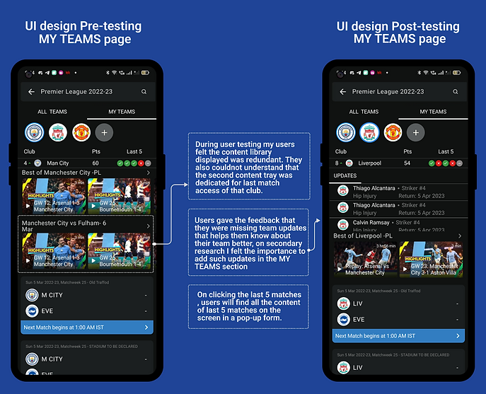
Breaking down My Teams


Thought Behind Action
Through insights gathered, football fans wants a curated content page dedicated to the team they are a fan of. As an OTT platform, the feature will increase footfall tremendously. The feature excited all users during my testing.
Critical Decision
Adding news and updates: Dedicated news updates for the club attracts the fans a lot. Keeping the section plain and grey removes the visual load off the screen, hence does not make it overwhelming to perceive.
Next upcoming card is kept as a primary CTA , and placement is done closer to thumb to lead them to the viewing portal where the ad placement is.
Let's Look into few Component Architecture
Sub Atoms


Duplicating the existing design system as close as possible to get a similar brand appearance of final design, I needed to duplicate the colour and text styles the esisting design system used.
Atoms Molecule and Organism

Buttons used in my design required to have 3 states - Default, pressed and Active to give the same experience.
The molecule consisting of set of buttons in their different state.
Every element is done in autolayout to keep them dynamic and versatile

Club icon set. These icons are individual atoms that have been used through out my designs in various shapes and form.

The molecule that you are seeing on top is made using each of the elements, that can switch places as per the need.
The states can switch places between themselves as per the case.


A glimpse of the Ui library I worked with, mainly consisting of the atoms, sub atoms of the complex component.
Let's look into an example of how I designed the component design system
As an example of how I designed the system library, I will breakdown the Match fixture card and show how I addressed all the use case and edge case just using the design system I built.

The example screen shot from my design shows the 3 different use case and few edge cases.
Use cases of the card is to inform users about :
1. Matches that has happened in the past
2. Match that will be the latest upcoming
3. Matches that will happen in the future
Watch the video explanation where I show my work process on these cards.
Let's summarize the iterations of the flow structure
While working on improving the sports section of Disney+Hotstar, I recognized the need to test various ideas and organize them under a user flow architecture. Through this process, I gained clarity on which features would offer the best user experience and which ones were feasible within my time constraints and viable enough to be implemented in an OTT platform. Iterating on the information architecture enabled me to simplify and streamline my ideas, eliminating impractical ones and merging those with the greatest potential impact.
